Branding, Typography
Typographical Revolution
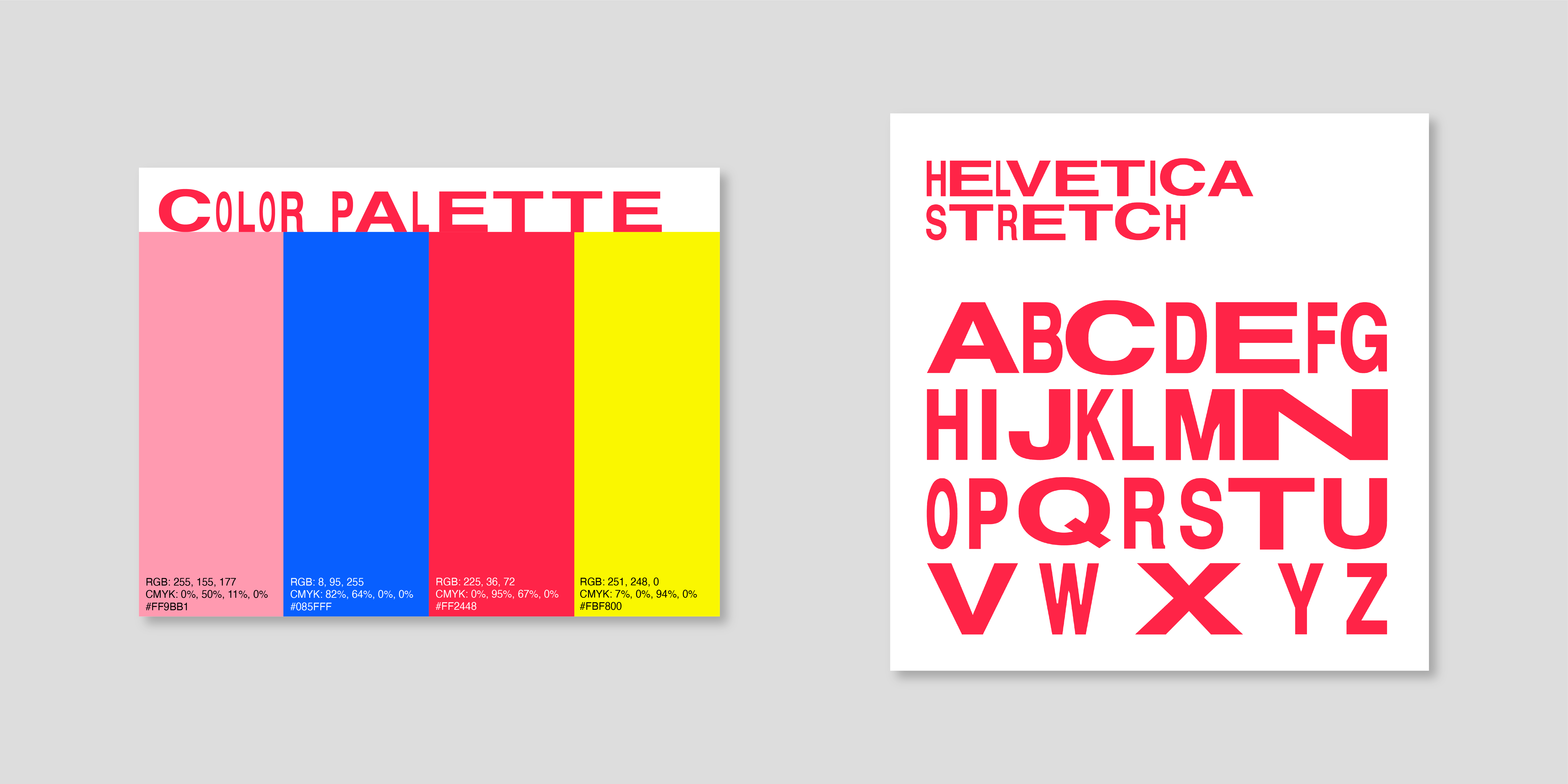
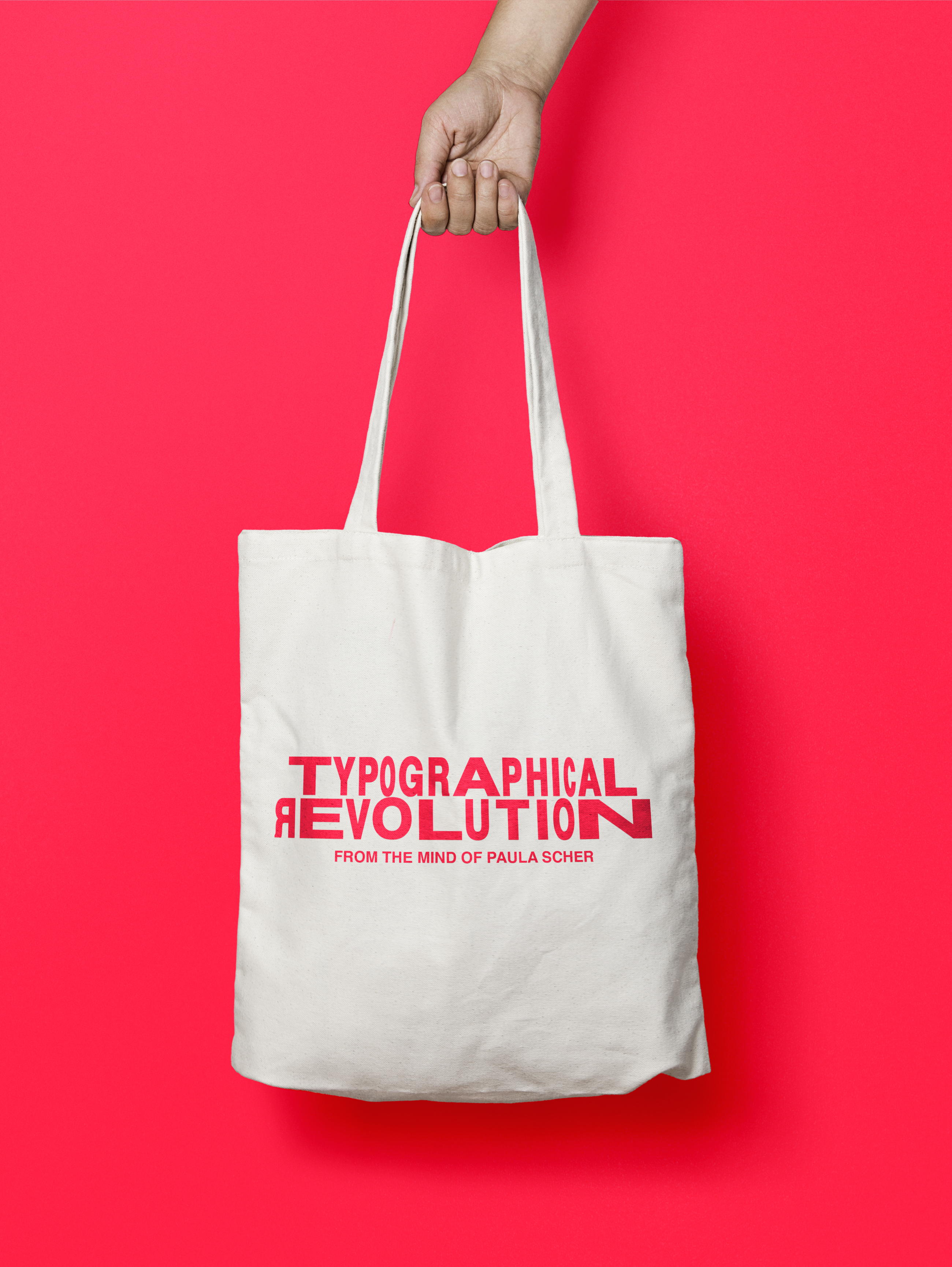
Conceptual exhibition branding of a retrospective chronicling the work and career of Paula Scher. Designed to evoke her pioneering typographical style.
Conceptual exhibition branding of a retrospective chronicling the work and career of Paula Scher. Designed to evoke her pioneering typographical style.


This brochure was created and printed during a previous iteration of the logotype. The “R” was added halfway into the project as a way to recognize Scher’s work could also be considered a revolutionary evolution.


