Environmental Philanthropy
Branding, Web DesignTHE CLIENT
The Campbell Foundation (TCF) is a family foundation that believes in strategic infusions of funding. It was established in 1998 to improve the conditions of America’s largest and most ecologically diverse estuary systems: the Chesapeake and Atlantic Coastal Bays. In response to a call for improved practices in philanthropy, they offer a broad range of grants. In 2025, they provided more than $28 million in grants to organizations focused on enabling vibrant, livable communities in watershed regions.
PROJECT GOALS
TCF was needing a full rebrand and robust website redesign. Their existing brand felt too closely tied to the environment and their website was extremely outdated and hard to navigate. They had begun to expand the scope of their philanthropic efforts to organizations focusing on topics beyond environmental issues and wanted their brand to align with their new focus.
MY ROLE
As lead designer for this project, I began by leading the TCF team in multiple workshops, creating a brand identity, moodboards and concepts, to understand their needs for the rebrand. In collaboration with the TCF team, we decided to move forward with a wordmark logo that would lend itself to evolve with the organization’s portfolio over time. I created multiple iterations of the wordmark exploring different font configurations that felt organic and authentic to TCF’s voice.
Once the brand was finalized, we moved into the website visual design phase, where I connected the new brand to the existing web materials the Friendly team had created. I outlined the full brand in a comprehensive brand guide.
THE WORK
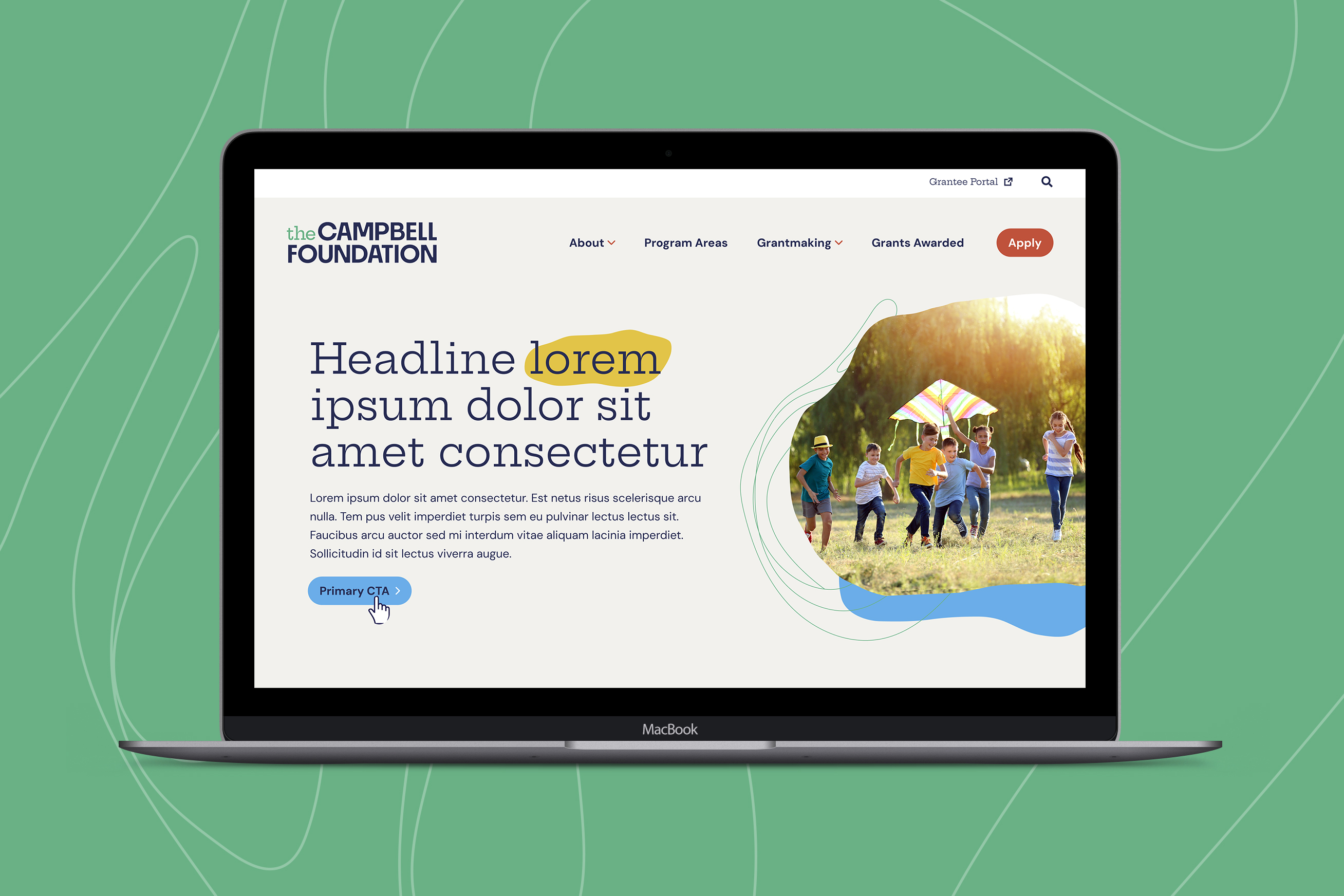
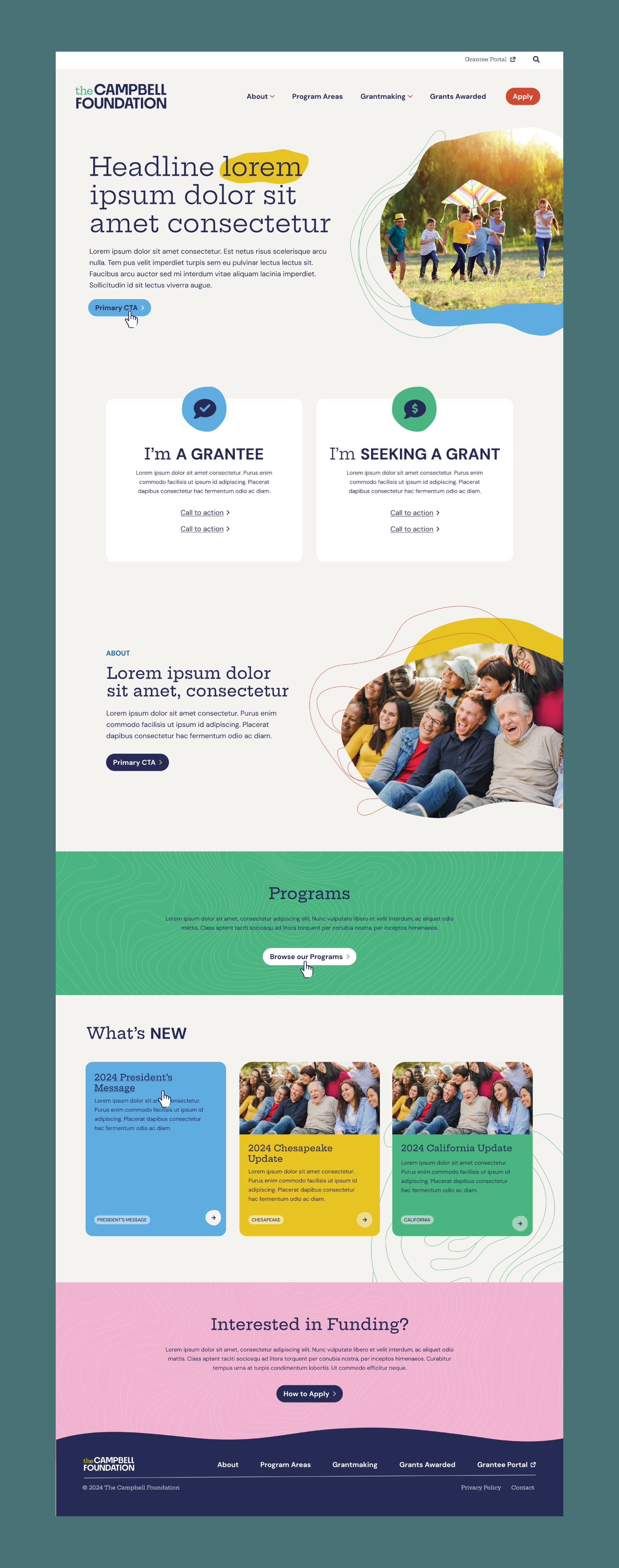
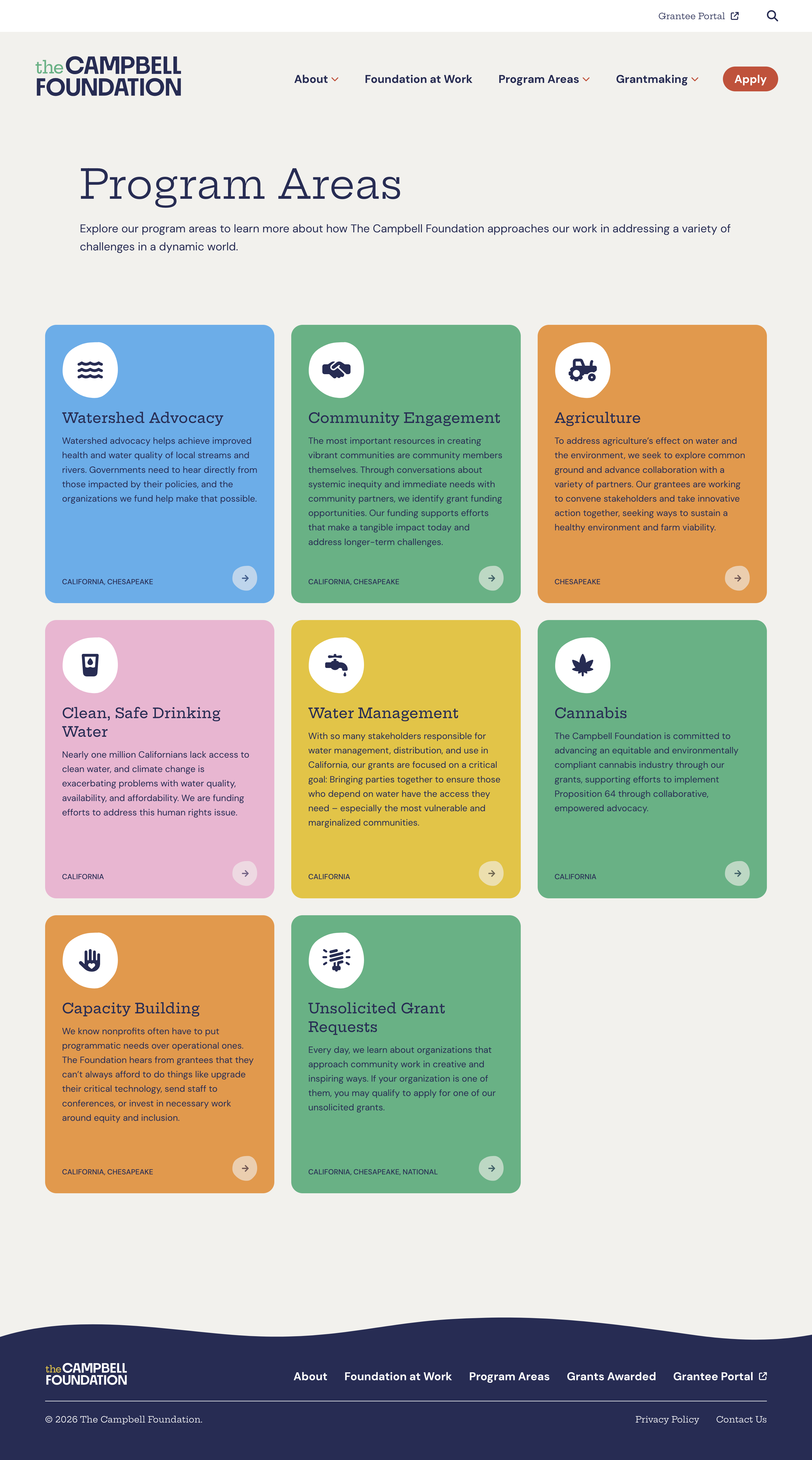
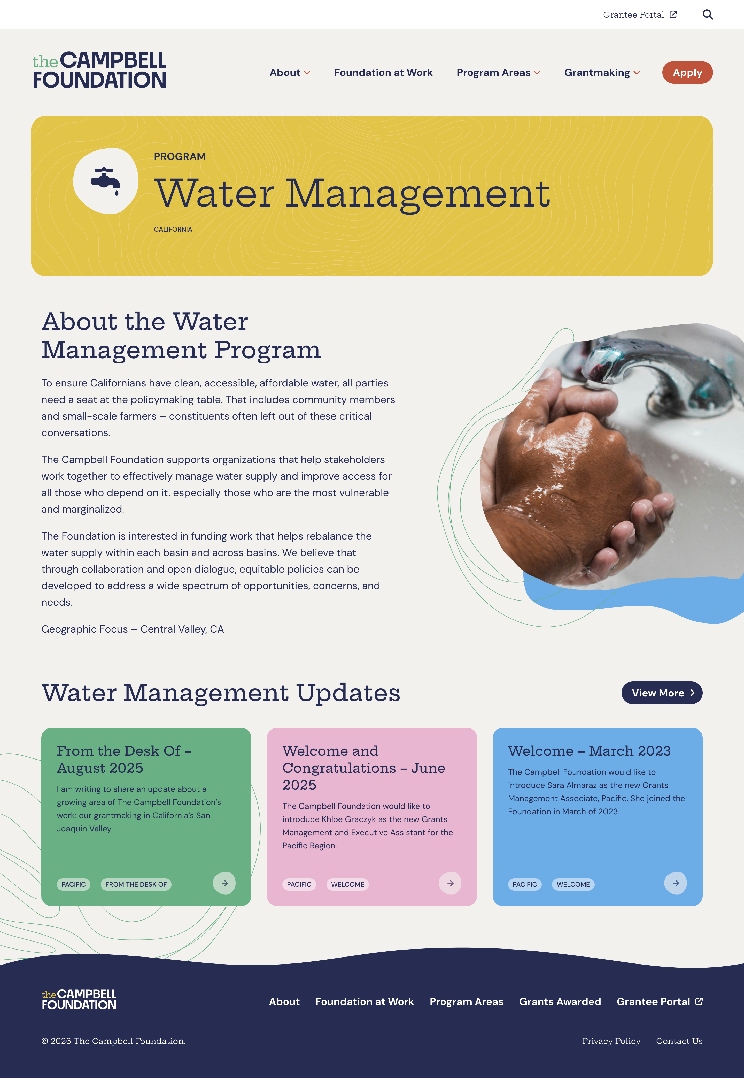
The logo features a bold sans serif typeface with unique details that feel contemporary and tie into the organic shapes used throughout the brand. The article “the” appears in slab serif typeface that adds a colorful visual element and adds a playful voice to the wordmark.
The extended brand is light and dynamic, taking inspiration from natural forms found in the environment. Thin line drawings supplement the blob-like forms to add an element of movement. The palette is colorful yet sophisticated, establishing TCF as a credible source of funding that shows genuine care for their grantees and stakeholders.
View the full site
The Campbell Foundation (TCF) is a family foundation that believes in strategic infusions of funding. It was established in 1998 to improve the conditions of America’s largest and most ecologically diverse estuary systems: the Chesapeake and Atlantic Coastal Bays. In response to a call for improved practices in philanthropy, they offer a broad range of grants. In 2025, they provided more than $28 million in grants to organizations focused on enabling vibrant, livable communities in watershed regions.
PROJECT GOALS
TCF was needing a full rebrand and robust website redesign. Their existing brand felt too closely tied to the environment and their website was extremely outdated and hard to navigate. They had begun to expand the scope of their philanthropic efforts to organizations focusing on topics beyond environmental issues and wanted their brand to align with their new focus.
MY ROLE
As lead designer for this project, I began by leading the TCF team in multiple workshops, creating a brand identity, moodboards and concepts, to understand their needs for the rebrand. In collaboration with the TCF team, we decided to move forward with a wordmark logo that would lend itself to evolve with the organization’s portfolio over time. I created multiple iterations of the wordmark exploring different font configurations that felt organic and authentic to TCF’s voice.
Once the brand was finalized, we moved into the website visual design phase, where I connected the new brand to the existing web materials the Friendly team had created. I outlined the full brand in a comprehensive brand guide.
THE WORK
The logo features a bold sans serif typeface with unique details that feel contemporary and tie into the organic shapes used throughout the brand. The article “the” appears in slab serif typeface that adds a colorful visual element and adds a playful voice to the wordmark.
The extended brand is light and dynamic, taking inspiration from natural forms found in the environment. Thin line drawings supplement the blob-like forms to add an element of movement. The palette is colorful yet sophisticated, establishing TCF as a credible source of funding that shows genuine care for their grantees and stakeholders.
View the full site
Client
The Campbell Foundation
Year
2025
Friendly Design Project Team
Gabi Mechaber, Design Lead
Alyssa Anduiza, Interactive Designer
Hannah Karl, Brand Design Director
Alicia Schreder and Erin Lisette, Project Managers
Ross Nover, Creative Director
Emmily Peterson and Canic Interactive, Developers